Little Greene Paints in Ilse Crawford’s Design Studio
We virtually step into the London office of one of today’s most distinguished British designers and uncover intriguing details.
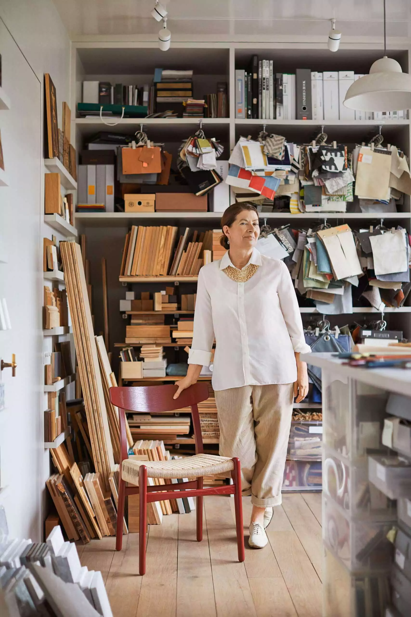
Ilse Crawford’s journey is truly inspiring. She ventured into the realm of design at the age of 40, having previously served as the editor of British Elle Decoration. Even then, she resisted interiors where the focus was on the aesthetics of objects rather than the personality of their owner, actively opposing photographers who stripped images of interiors of any traces of real life to achieve a neater composition. Ilse believed this approach turned the magazine into a mere catalog.
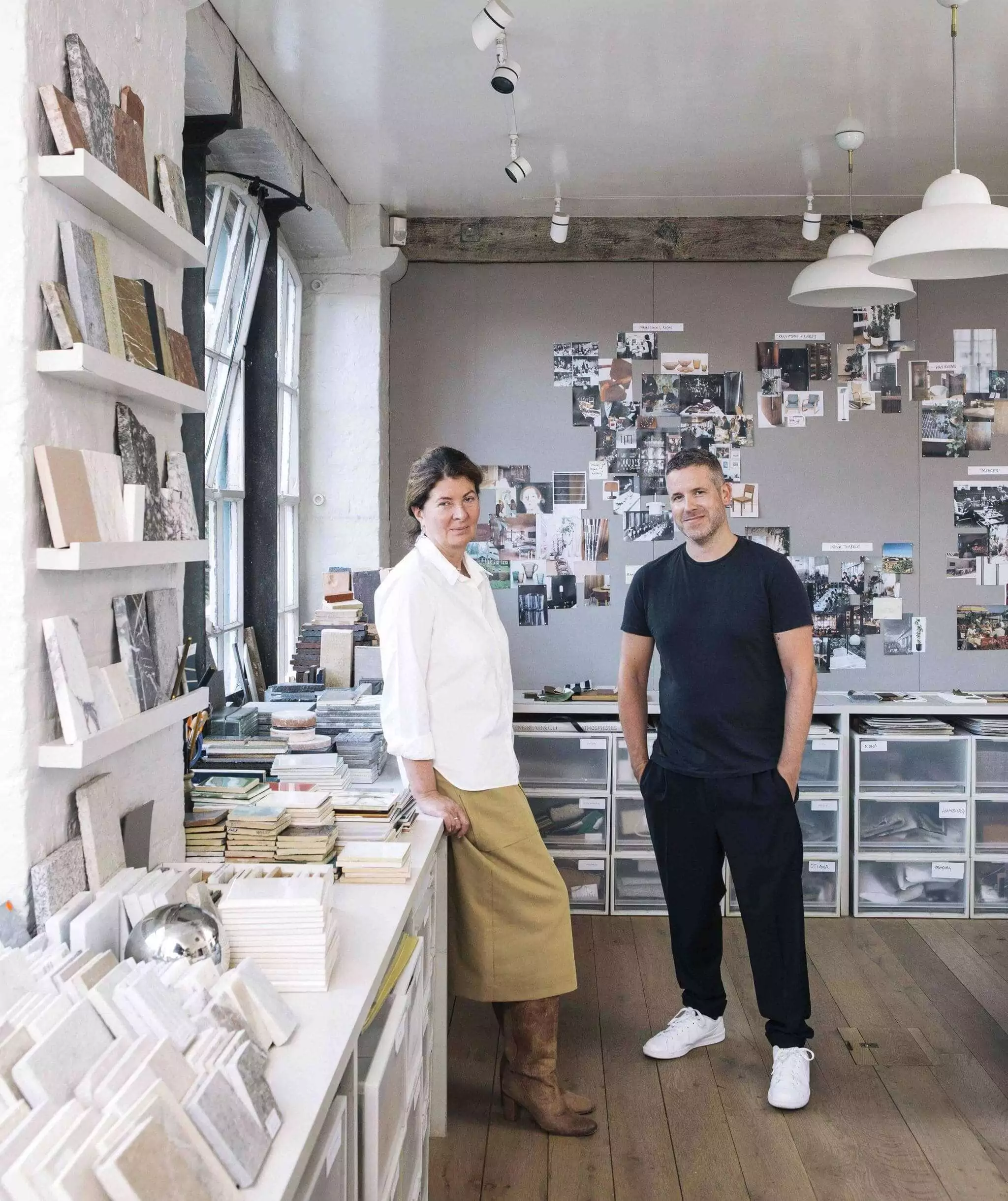
After a decade in editing, she transitioned from journalism. A couple of years later, in 2003, Ilse established her own office, Studioilse, in the heart of London, and commenced crafting both private and public interiors. These spaces may differ in style and budget, but are unmistakably bound together by a profound appreciation for natural materials, especially wood, a reverence for the Arts & Crafts movement, and a penchant for iconic 20th-century design pieces.
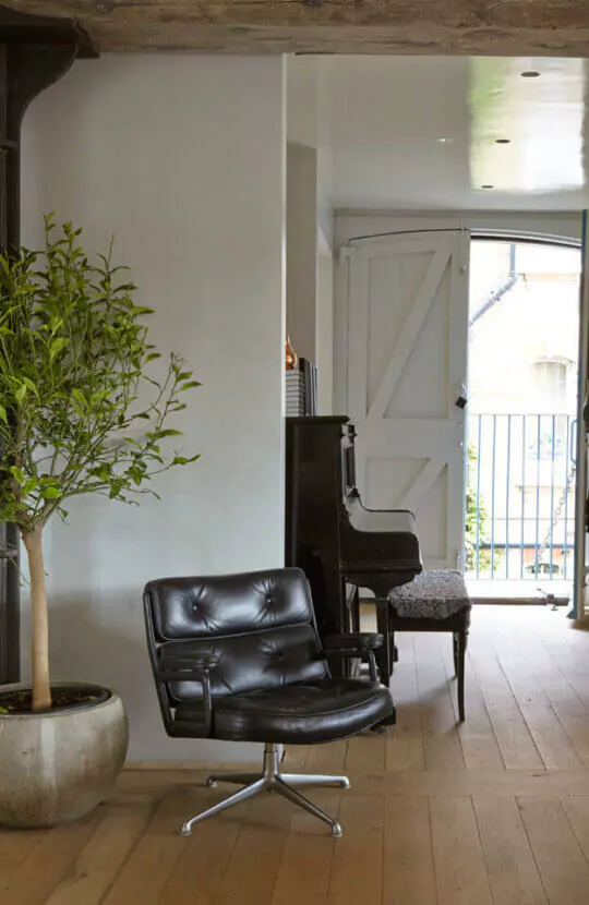

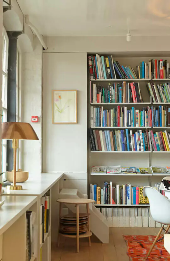
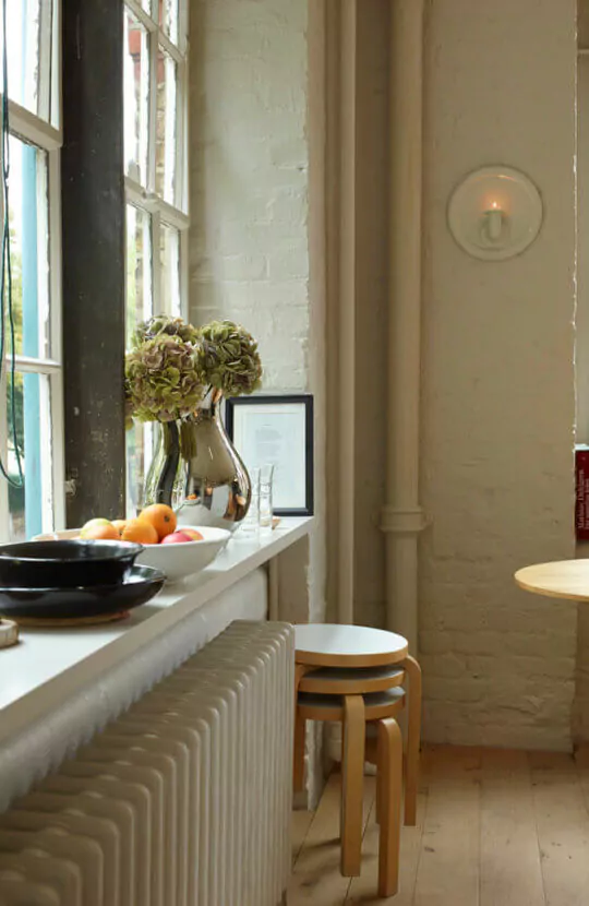
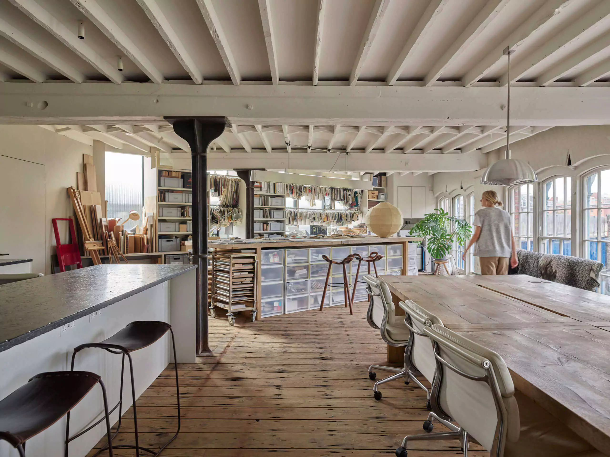
Ilse Crawford’s Interiors
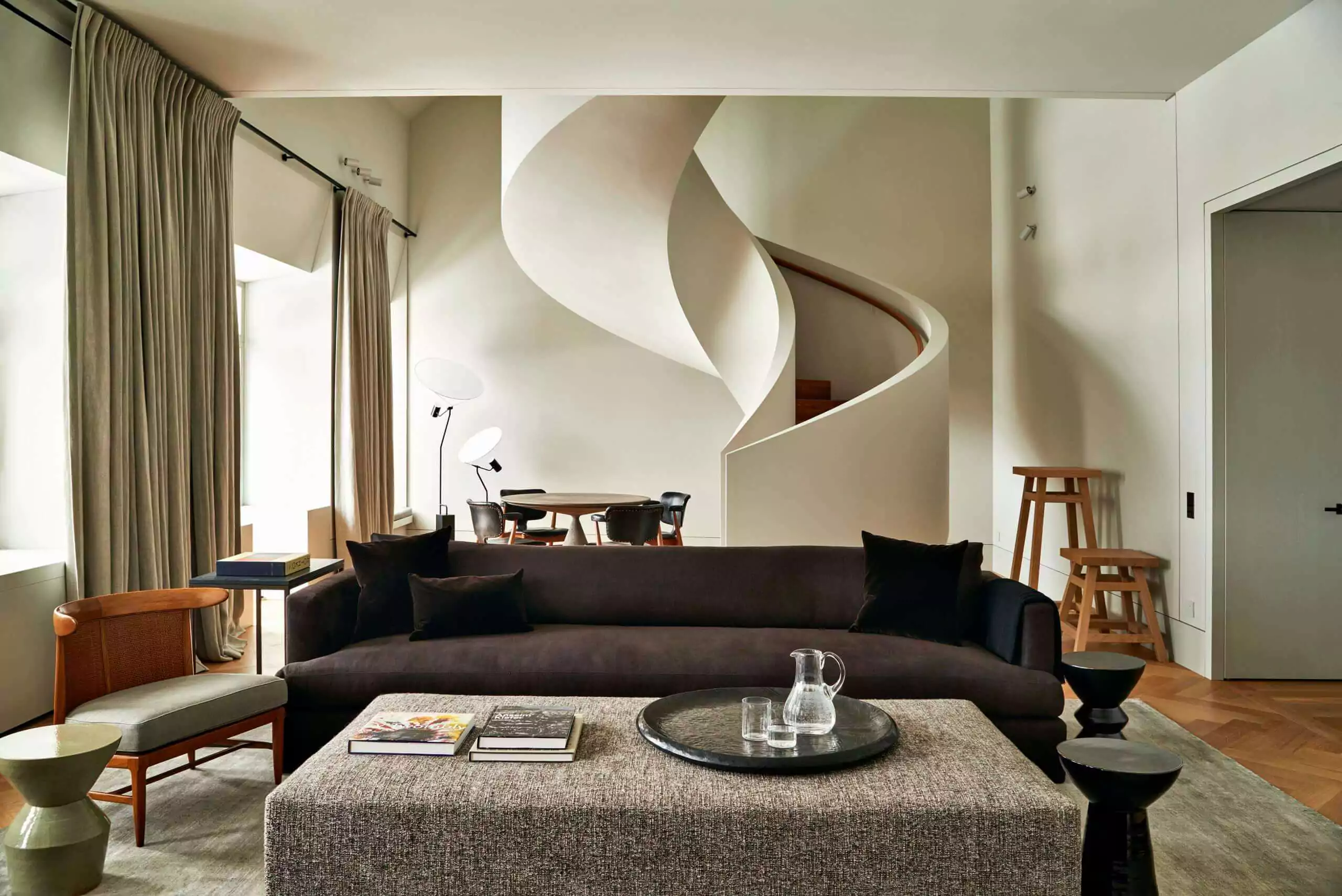
We are captivated by Ilse Crawford’s ability to create profoundly human interiors. They eschew the minimalist, somewhat austere elegance favored by Vincent van Duysen, a style which greatly resonates with Ilse. Instead, her interiors are enriched with details; one might aptly term them consciously decorator-driven, yet they maintain a flawless equilibrium, devoid of any excess.
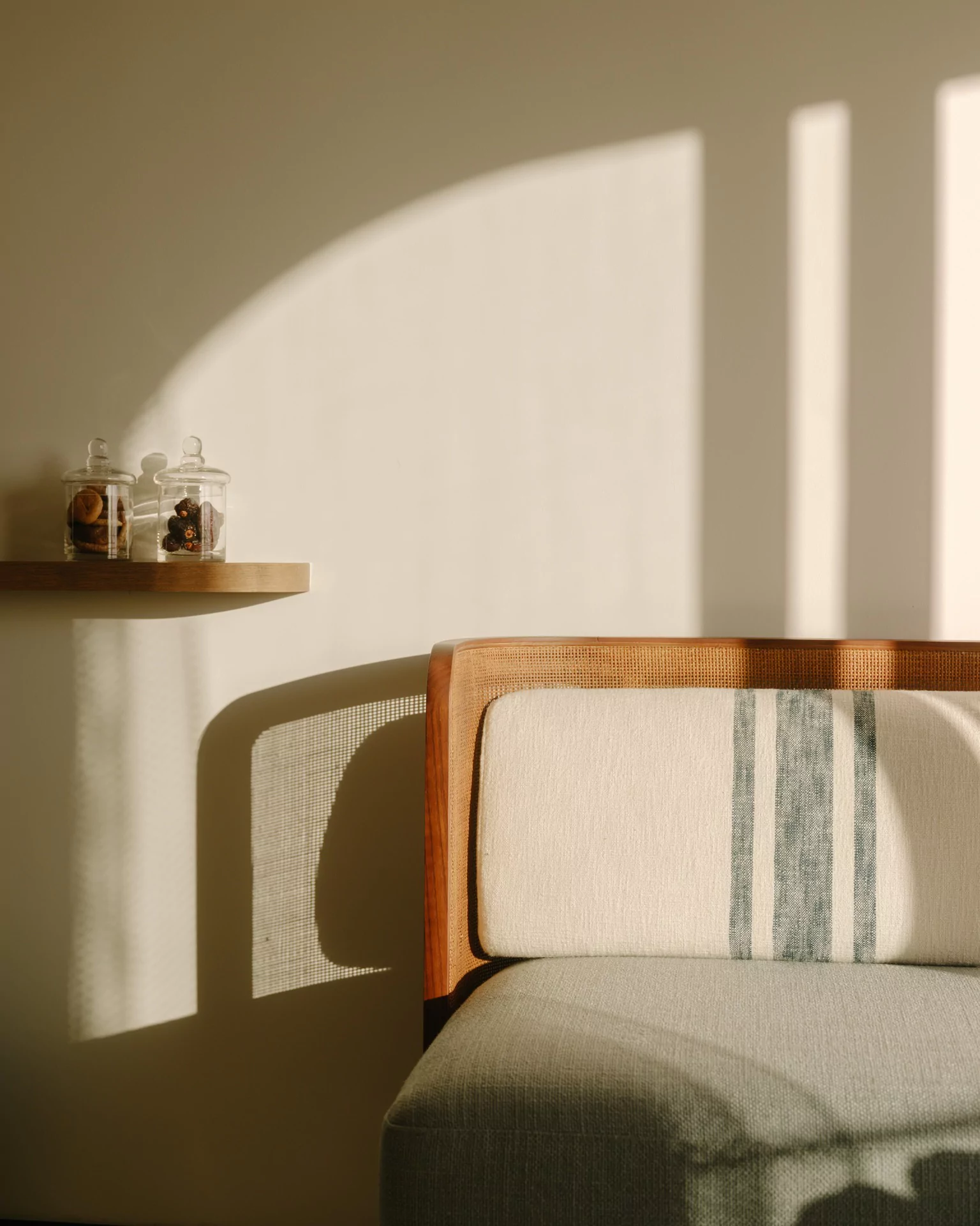
“As our lives become increasingly virtual, we find ourselves drawn to the tactile, the physically palpable. Design is more than just what meets the eye; it speaks to all our senses; we yearn to touch it, to use it, to inhale it. It’s not sufficient to assemble a collection of beautiful objects; people should delight in touching them, in using them”.
Ilse Crawford

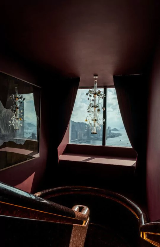
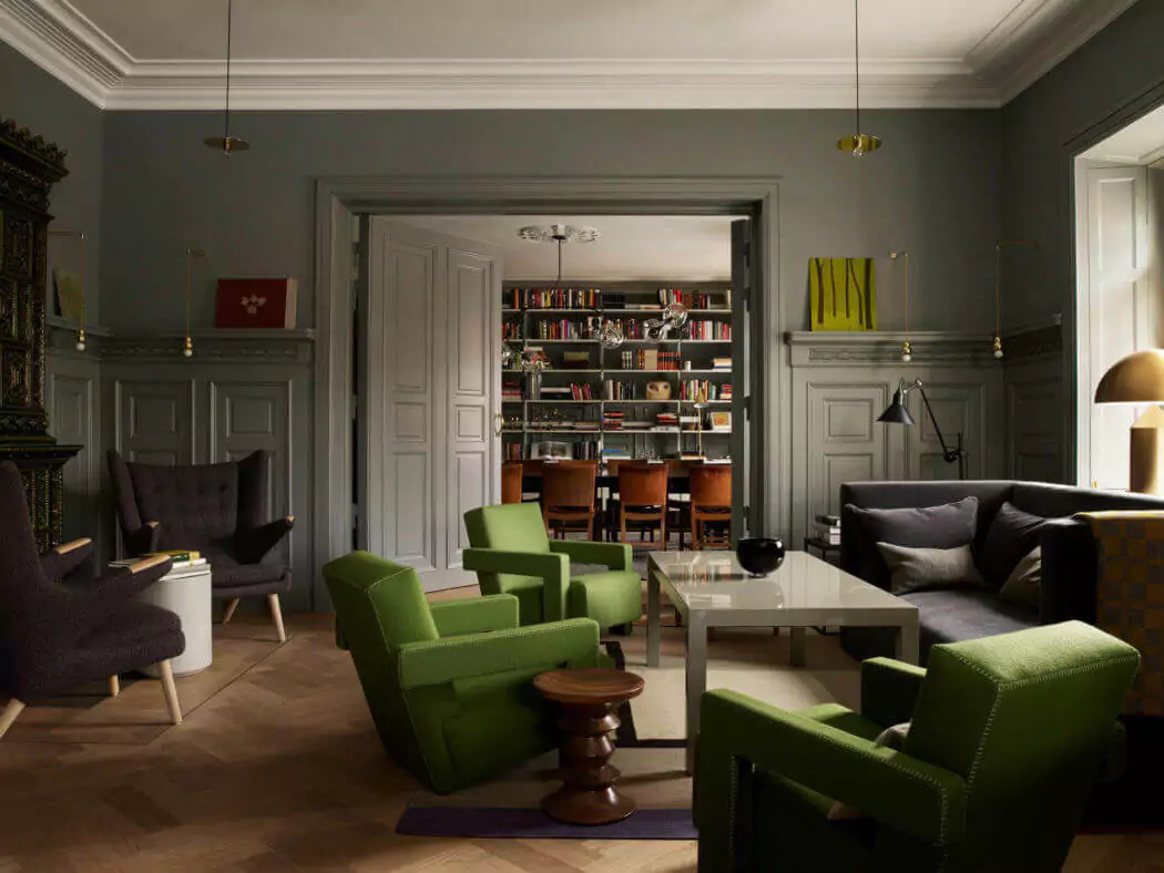
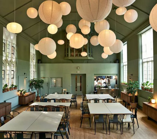
Ilse Crawford and Little Greene
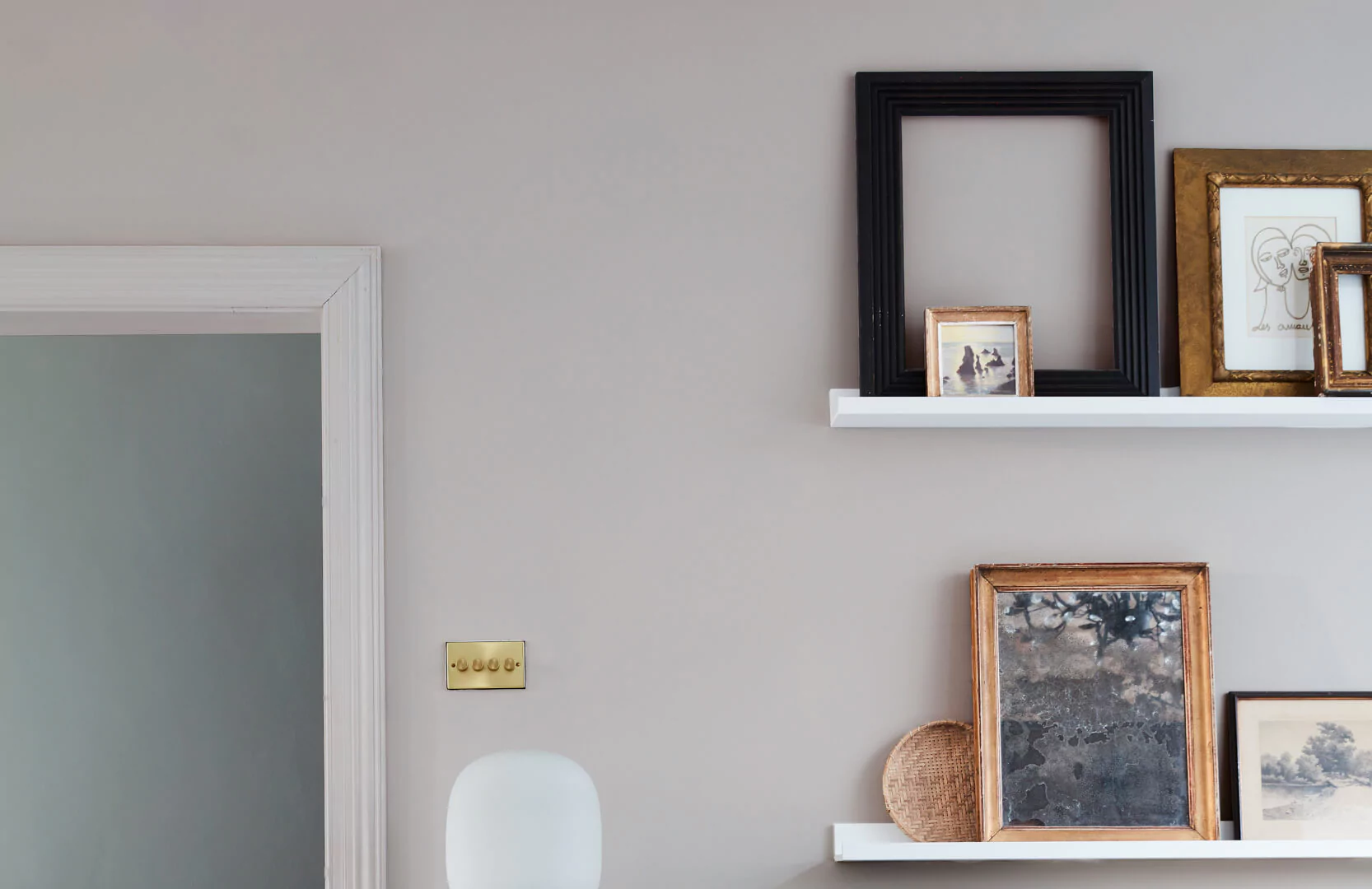
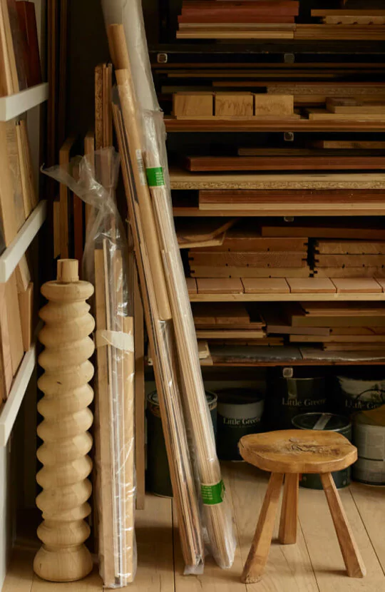
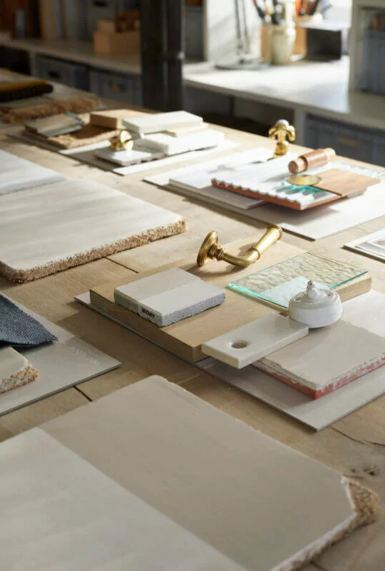
It’s worth noting separately that Ilse Crawford is an exceptional colorist, and naturally, we were keen to discover her choice of paints. After perusing atmospheric photographs of the Studioilse office, we uncovered Ilse’s personal preferences.
Ilse Crawford and Carl Hansen & Son
Color stands as a potent instrument for transforming interiors and the objects within them. Here, we recall Ilse Crawford with great enthusiasm and share her collaborative venture with Carl Hansen & Son. This company possesses the rights to produce items conceived by Hans Wegner and is primarily linked with the illustrious Danish designer.
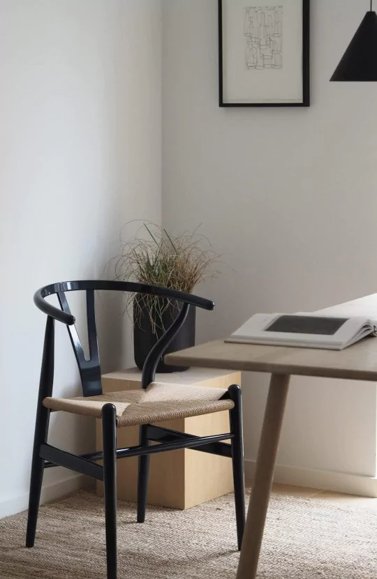
To commemorate the 70th anniversary of the iconic CH24 chair, better known as the Wishbone Chair, Carl Hansen & Son turned to Ilse Crawford to interpret the classic design through the lens of color.
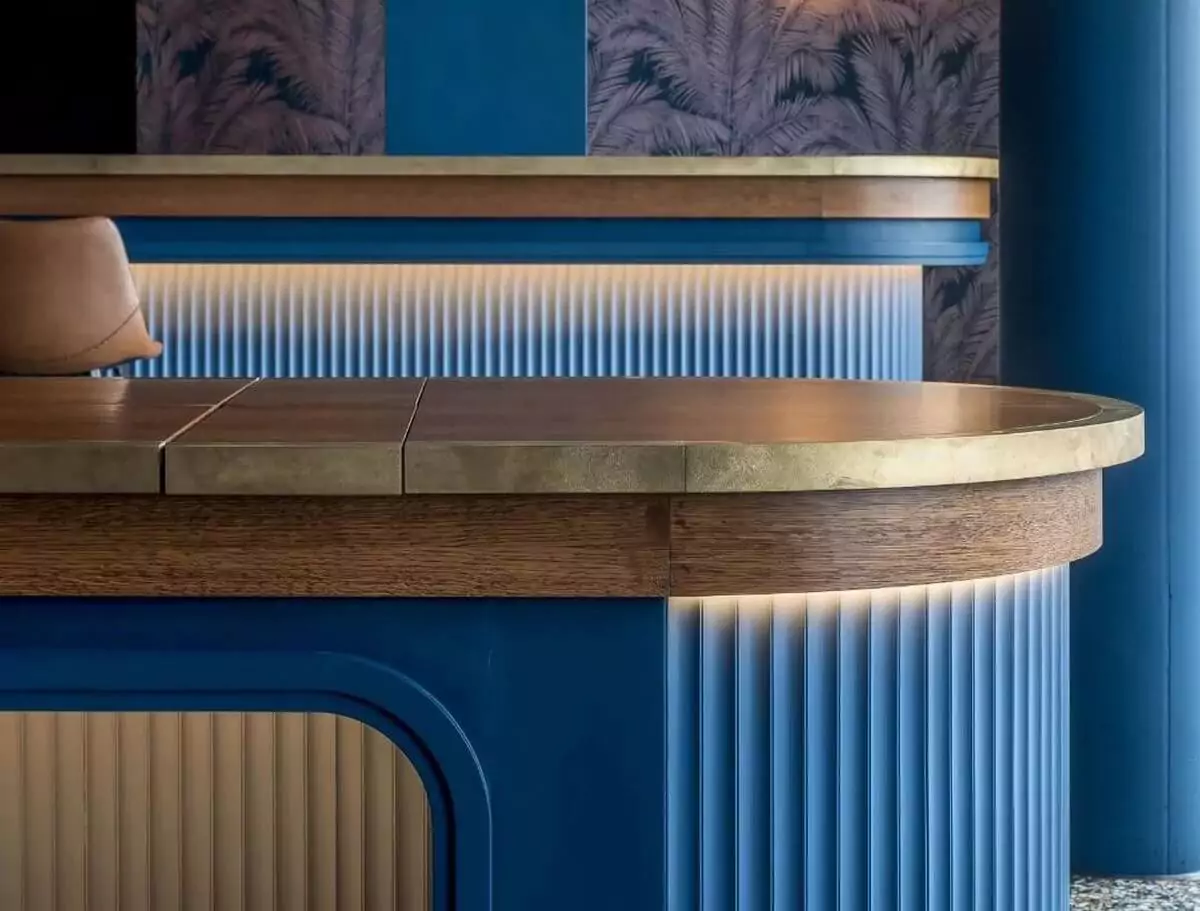
“With meticulous attention to Hans Wegner’s legacy and cultural heritage, we conceived a dark blue lacquer finish as a tribute to Chinese art and crafts that inspired the form of the Wishbone Chair, including white-blue porcelain and traditional Chinese lacquer”.
Ilse Crawford
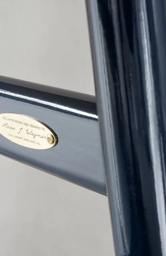
The outcome so impressed Carl Hansen & Son that the company opted to entrust the British designer with devising a fresh color palette for an additional four Wegner chairs. “The opportunity to rejuvenate them for a new generation is an immense pleasure,” remarks the director of Carl Hansen & Son, articulating not only complimentarily but also exceptionally astutely, “Ilse possesses the capacity to infuse any project with profound insight and contemporary relevance”.
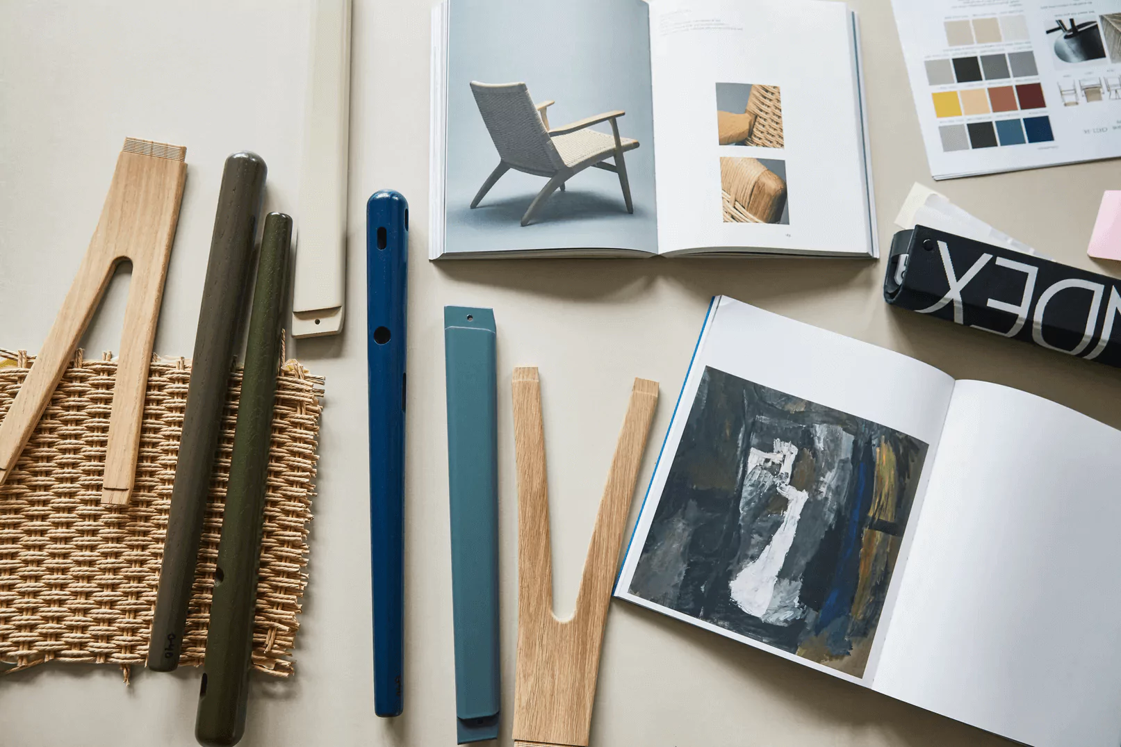
The designer proposed a palette of five intricate deep hues, inspired by the expressive works of Per Kirkeby, one of Denmark’s most eminent artists. “Our aim was to create a set of colors that mirror the era we inhabit. I am confident that these understated tones will strike a chord with a contemporary audience,” shares Crawford.
“We drew inspiration from Per Kirkeby’s canvases: his fascination with nature and geology is vividly depicted in his works. These are not merely trendy or ornamental shades, but ones that lend depth and complexity to any interior”.
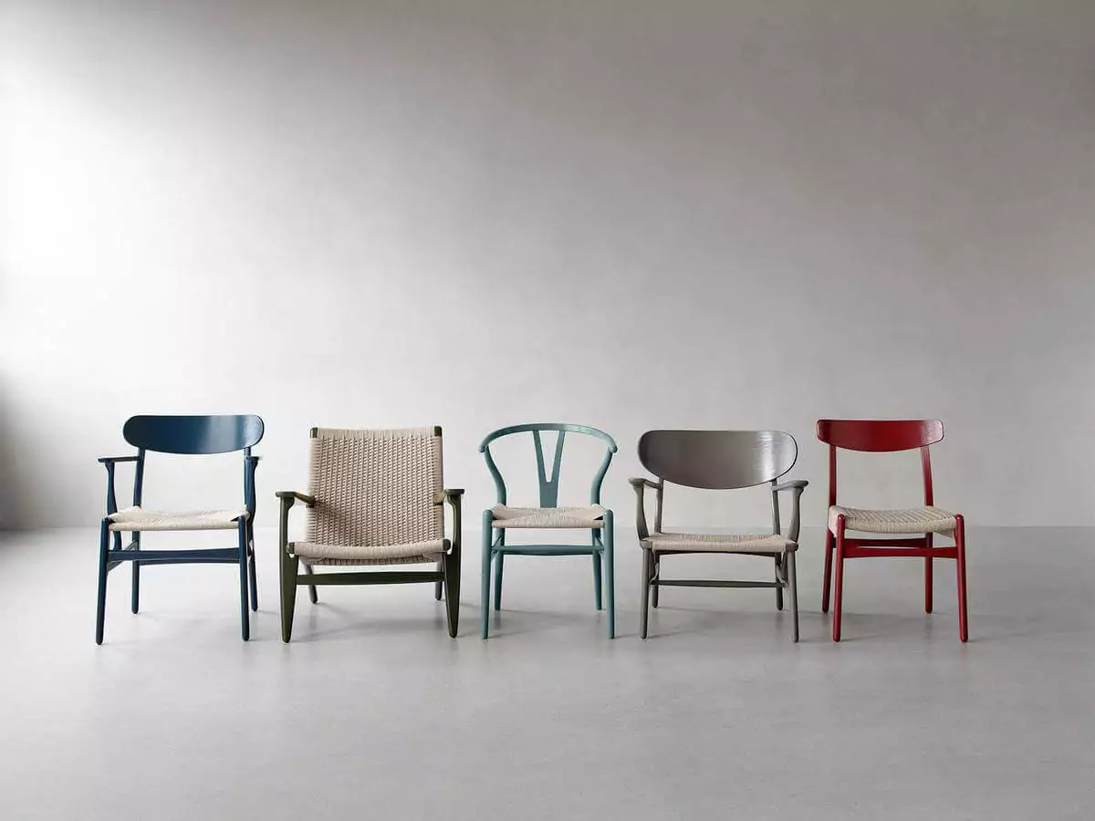
Without a doubt, Wegner’s design shines in its original ‘wooden’ rendition. However, it’s challenging to dispute that the meticulously curated range of complex deep shades turned out to be exceptionally fitting and harmonious. Bravo, Ilse!
